Code
The source code I chose was for the SVG logo animation in the upper, left corner. I like the way this was styled and animated. The choice of seperate animation paths for each initial made for an interesting pattern.
User Interface
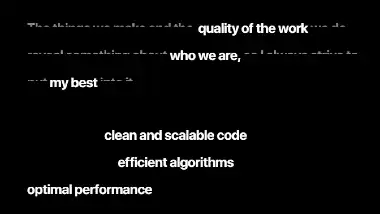
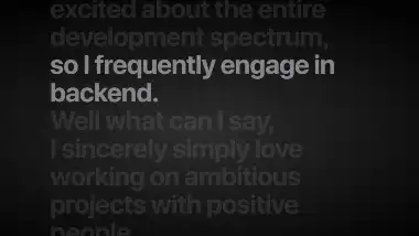
The user interface for this site has a moody and modern feel to it. The site is made up of blacks and grays and has a very monochromatic feel. I like the way sections appear on scroll and the animations for the different sections.
User Experience
This site has some cool features to it but is also a bit annoying to navigate. The animations and different loading paths add some fun to an otherwise bland site. I do wish there was an accent color to liven up the page but enjoy the use of animations. I found the scrolling to become annoying in a short while on the site and wish he utilized a main nav menu.
Summary
I like the idea of a scroll only website in theory but do like the option of navigation. I have built a similar site but added navigation links at the top that moved to sections along the page. I think overall the site is clean, functional, and serves it's purpose.