Code
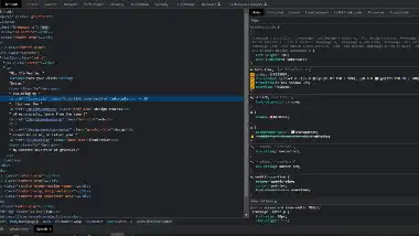
The source code I chose for my review is of the different link styling throughout Veerle's introduction paragraph. I found this code to be quite fitting for this week's review as it is done using custom properties. I mimicked this styling in my H2 links on my main element.
User Interface - UI
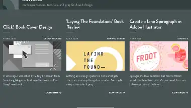
Veerle's site has a very whimsical feel to the styling. The screenshot I took for UI shows a grayscale being applied to the hover of some of the elements. There are a lot of interesting custom properties that are able to come together for a cohesive, yet unique website. Though the majority of the website is white space, it has a very bold and colorful design. Veerle has managed to use a handful of bold colors with strategic placement to create a simple, yet lively color scheme.
User Experience - UX
My immediate response to this site was excitement! The loading animation of Veerle's svg logo was an instant attention-grabber. I really enjoy the small pops of color throughout the site. The bold color choices offer a fun feel that is balanced by an abundance of white. It gives the feel of a kaleidoscope with a fairly modest color pallet.
Summary
The homepage for Veerle was by far my favorite page on the site due to the clever animations and custom properties. Veerle did a great job of making her introduction links stand out, urging you to click them and explore her site. I really enjoyed exploring to find all the unique custom properties used throughout the site. This was immediately one of my favorite websites I have even been in regard to style, ease of use, and content!